KEVIN CHANDLER
TECHNICAL UI DESIGNER

UI/UX
A good portion of my work in game development is UX design and UI implementation. I'm a big believer in layering information using motion, color, position and shape and iconography for snapshot understanding. I want players to be able to see and understand information at a glance so I try to break up elements into digestible pieces. For menus and interfaces I tend to think about navigation and feel first then think about aesthetics.
For Technical Implementation, an element that can only be used once needs a very good reason to exist. I like to keep things as data driven as possible, holding things like color information, certain textures, lists, and configurations in data assets, datatables and slate. I work closely with UI Artists bring their vision to life and in turn I work to minimize the number of textures that need to be added to a project
Bottom line is I am a problem solver with a passion for designing and implementing great user experiences. I am never done learning, improving and trying new things. Thank you for your time.
For t
Vehicle Health Bar
I was tasked with making a health bar for the team vehicle for our cooperative extraction looter game.
Requirements
- Show the amount of health remaining
- Show that the vehicle needed to be repaired
Extras I wanted
- Show when the vehicle is damaged
- Show when a repair point has appeared
- Show how many points are needed to be repaired
The vehicle health bar is divided up into 10 or so segments and as the vehicle takes damage, players can see the health go down on a segment and when it drops below a segment threshold, a new repair point would appear. When repair point is fixed, a segment of health was restored.
The journey we went through to reach the final version involved many iterations and design changes related to the shifting priorities in the game, but it eventually settled on what I think is the best version of the system. You can see the journey the health system went through in the video.
Playtests have shown that people understand that health is being lost, but some people don't connect the repair points to the segments until after their first repair. Wreck Runners falls into the friendslop/friendjank genre which gives a lot more grace for game mechanic discovery and players are more willing to share information with each other. Until more feedback comes in on this topic, I think that enough players will see a repair point, interact with it and see the health bar react to to the repair to propagate the knowledge effectively.
Salvage Label
In Wreck Runners, players have to gather salvage to turn in for money to meet the required quota and buy items and upgrades. Each piece of salvage has an associated weight, which is important because the player vehicle has a limited weight capacity, so players have to judge the utility of an item at a glance.
Salvage value is tied to health, so as the health is reduced you see associated value go down as well.
The color scheme indicates the relative value of salvage and follows general gameplay conventions for color.
Grey - Junk
White - Common
Green - Uncommon
Purple - Rare
Orange - Epic
The color schemes are drawn from a data asset for easy tuning and an alternate data asset can be swapped out for color blind mode. The properties of each piece of salvage like value and weight are being drawn from a datatable.
There are two other modifier types for salvage indicated by tags that pop out from the top and right of the label as needed. The first modifier is the salvage type. If the salvage has a red label with a sword icon, it is considered a combat type of salvage, meaning it does extra damage to enemies when struck with it. A yellow label with the universal symbol for fragile indicates salvage has less durability and players must take extra care when transporting it.
Salvage has a chance to get a paranormal effect, like low gravity, health drain, or player voice modification. The purple paranormal label gives a name or nickname for what the paranormal effect does.
The nice thing about the modifier labels is that there is room for further gameplay expansion later. The team is constantly adding new curses, so the label works at scale. The type modifier allows for any number of additional statuses, like explosive, electrified, or radioactive. It just needs a color and and an icon.
I came up with the initial design, then we worked as a team to iterate on it. There are concepts for a cleaner version that eliminates the need for a number for weight, however there are some hurdles to overcome. Without a number value it is more difficult for players to plan and optimize their load to stay underweight and mobile.
Playtest feedback from about 8,000 players showed no confusion on what the labels indicate. The only confusion is the combat salvage icon. Most players get that the sword indicates that it can do damage, but watching streamers there was more than one comment saying they didn't know why that piece of salvage had a red label. We added some red lightning vfx on the salvage to further indicate the damage potential in the hopes that it would be more obvious. I am going to try some different icons, perhaps a spiked ball or a board being snapped in half to indicate damage. More than likely though it's something that will spread by word of mouth as the game's audience grows and it may not be necessary.


Figma Mockup

Standard Label

Combat Modifier

Value/Health Reduction

Fragile Modifier

Paranormal Modifier
Value/Health Reduction

In Game


Vehicle Weight System
A major mechanic in the game is how weight affects the player vehicle. The vehicle can drive, fly and swim above and below the water, however if the vehicle weight goes above a certain threshold, the vehicle's capabilities are reduced. If the vehicle is overweight, the vehicle can no longer fly and the vehicle sinks to ocean bottom. A the next threshold, the vehicle would be completely immobile.
To communicate this, I designed a weight bar with a line indicating where the threshold to be overweight would be and the full bar would put the vehicle in it's immobile state. The feedback I got was that it was somewhat hard to read and it was unclear what the white line meant.
It was refactored to be a bar that fills twice. The first fill gets the vehicle to be overweight and when it fills again the vehicle is immobile.
Playtest feedback has shown widespread acceptance of the bar. There is a problem with first time players not realizing when it crosses the threshold to being overweight, so something to draw the eye to the bar is needed.
Quota System
For Wreck Runners, we needed to communicate a lot of information to the player the player about progress towards meeting the team's salvage collection quota. I analyzed the problem, identified the needs, broke down the menu into defined states, then worked with our 2D concept artist to make the final version. You can see the full breakdown in the video.
Playtests showed that people understand the design right away, but the one downside is people would deposit the quota, then assume you couldn't go back out and get more loot. They assume they get one shot to deposit so they load the vehicle to the gills and risk timing out and losing. The debate is ongoing whether we let the players learn by playing and failing, or include this as part of the tutorial.
Level Ex: Medical Training Simulations
At Level Ex I supervised the level design team in making medical simulations that translated complex medical procedures into simple motions and easily digestible steps that could be done with a mouse or touch screen.
The problem that I found when I got there was designers were trying to do too much in a single step. An action like twist and pull to remove a tool might be clinically accurate, but designers were trying to do both at once and the interaction was getting muddled. How far does the user twist before the pull because available? What if the finger is covering up the indicator for what to do next?
If you allow pulling while twisting won't you end up with the tool clipping through the skin because the animation doesn't match the user's action?
I identified three major problems
1. During the onboarding/storyboarding process, designers were either not in the room with the salesmen/producers or were not pushing back hard enough against doctors who wanted to be as clinically accurate as possible
2. The list of available actions designers wanted to employ was too long and actions too complicated
3. There wasn't enough signs and feedback for what to do
Problem 1 was solved by an agreed upon list of allowed interactions, and I insisted that a designer be present whenever storyboards were discussed. If a single interaction contained multiple actions, designers would call it out and it would be broken up.
For problem 2, I identified that nearly every complex surgery, from cataract surgery to knee replacements, could be broken down into the following actions
- Tap/Click
- Tap/Click and Drag
- Tap/Click and Rotate
- Drag and Drop
For problem 3, doctors would assume that by listing the instruction users would just understand, so they would gloss over steps. During greybox I would purposefully not share the progress on a module between different teams so I could hijack someone to come test it out and see if they could get through it with the provided instructions. If not, the step got an arrow indicator, glowing circle or a button highlight.
Simplifying interactions and having clear guidelines during the storyboard process reduced ambiguity during greybox and reduced development time by weeks.
On a side note, one of those training simulations was for the Artemis program as a guide to using a special medical scanner. It's cool to think that something I had a hand in developing has gone to the moon and back.


Light of Mine: VR User Interface
Working at the nonPareil Institute, we got our hands on an HTC Vive several months before it came out and got to be part of the first wave of VR games on Steam. It was the wild west. We were trying anything and everything and I got to experiment with new ways to do menus and control schemes.
Light of Mine was a VR horror game where players had to navigate the world with a candle and flashlight to solve puzzles while avoiding the living statues. The statues would only move when out of view, similar to the ghosts in Mario or the Weeping Angels from Dr. Who.
We wanted the player to move through the world without getting motion sick and without having to teleport around. Early research and examples like Eagle Flight showed the dominant way that players should move is always to orient to the head and it should be analog input so players could smoothly get up to speed. Rotation orientation locked to the head made longer play sessions possible and felt really fun. It also lent itself well to the gameplay where players have do keep looking at enemies to keep them from moving, putting players in a situation where they had to either walk backwards to keep them in view, or whip around and run away.
Using the HTC Vive trackpad, a player could dial up the speed to their comfort level by moving a thumb back and forth.
For Menus, I found that while it was possible to hold a controller over a menu item and press a button to select it, it was annoying because the act of pressing an input would sometimes move the controller enough to move the aim off the menu item. I found that just holding the a laser over an item and adding a fill line, it felt a lot easier to navigate.
One of the priorities I was given was to tell the store of the nonPareil institute, so in the about section I made a panoramic texture full of candid shots of members of the institute. I also incorporated video clips and in VR they could be viewed as tall as a movie theater screen.
We took the game to several conventions including Quake Con. Out of 60 testers, only 10 reported discomfort after 15 minutes of play, which is quite remarkable since reports show somewhere between 40% to 70% experience motion sickness.
Voide Royale: Figma To Unreal Workflow
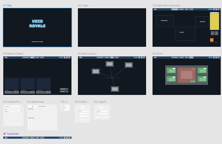
I have an ongoing project as a proof of concept for a direct Figma to Unreal workflow. A number of years ago I was working on a concept for a three player coop space fighter game that played like monster hunter except the monsters were capital ships you had to take down and the pieces you knock off could be used to upgrade your fighter. I wanted to make a menu that caused the world to react when selecting the navigation buttons so I made a simple set of animations to go with the widgets.
The menu was inspired by Descent: Freespace and a game called The Cycle: Frontier. Descent Freespace had a menu where you would move your mouse over parts of a hanger and different parts of the ship would animate, indicating you could click and enter that area of the ship. The Cycle: Frontier had a hub world where you could walk around and upgrade your character and weapons by talking to vendors, but there was also a navigation bar at the top for quick navigation between vendors. I always thought that was a great feature that preserved the first time user experience while accomodating veteran players who want to get in, make their modifications and get back into the game as soon as possible.
I made the menu a few years ago, but now I want to recreate it using a Figma to Unreal work flow. I've made the navigable version in Figma with a full menu flow has preset components for easy style changes.
Void Royale Figma
I've translated Figma components to Unreal before which requires exporting out components as textures and directly importing them, but experimenting with plugins like Unreal2Figma I find myself wanting more. The plugin can create textures and widgets, but it doesn't translate any of the navigation. Creating my own plugin is going to be my next project I believe.

Vehicle HMI

Automotive HMI
Unreal has put an emphasis on vehicle Human Machine interfaces as an application of the game engine. Here is an example of an HMI I made for an electric vehicle as a design test.
Required Features
- Functional Speedometer and Tachometer
- Custom material shader for the fill bars
- Battery Level
- Battery State Condition (Draining, Generative Breaking)
- Scrollable album list
- Dashboard Icons in an active, and inactive state
Extra Features
- Functional Clock based on the the time on the system
- Added Flashing state to icons
- Color Blind Mode for indicator icons
- Debug tools for testing functionality
- Units switch between Metric and Imperial
- Red warning vignetting on the border to draw attention to the display if there is a new alert
*The art is not mine but I made the functionality